
The history of the Washington Redskins Logo is mired in controversy. No NFL team has had as much fuss made about their logo and name as Washington has. It’s not even close. You’re likely already asking yourself if this should be the Washington Redskins logo history or the Washington Commanders logo history?
In 2013, current Washington owner Daniel Snyder told USA Today that he would not change the name.
He added the now famous:
“It’s that simple. NEVER — you can use caps.”
Obviously, Daniel Snyder decided he would change the name and logo. He did away with the name Redskins in 2020, in favor of Football Team. Never for the word Redskins to be uttered in print again for a while. With it went a logo and look that has stood virtually unchanged for almost five decades.
Washington Football Team For A Minute
Washington’s quest for a new identity began when they re-named the team to the Washington Football Team, which seemed forced. It was always just a stop gap. That’s when some think Snyder began talks with NFL commissioner Roger Goodell about changing the name that was considered by some to be racist or offensive. There’s a lot to the story. Best let sleeping dogs lie.
Washington Redskins Logo History Officially Becomes The Commanders Logo History
In 2022, Washington finally made a permanent change – to the name Commanders. It was met with very mixed reviews. The team kept its burgundy and gold colors but did away with any Native American imagery.
At the unveiling of the new name and new uniforms, defensive tackle Jonathan Allen said, “If you’re looking just at the name, well, the name doesn’t mean anything to you. There’s no history there. You’ve never seen anyone play for that team, there’s no uniforms, so obviously you’re not going to like it. But once you come out, you see the atmosphere, you see the new helmets, you see the new uniform, you see the players wearing it, you see the culture we’ve built around it, it’s going to make a lot of people happy.”
[Best_Wordpress_Gallery id=”37″ gal_title=”Washington Logos”]
Washington Redskins Logo History And Evolution
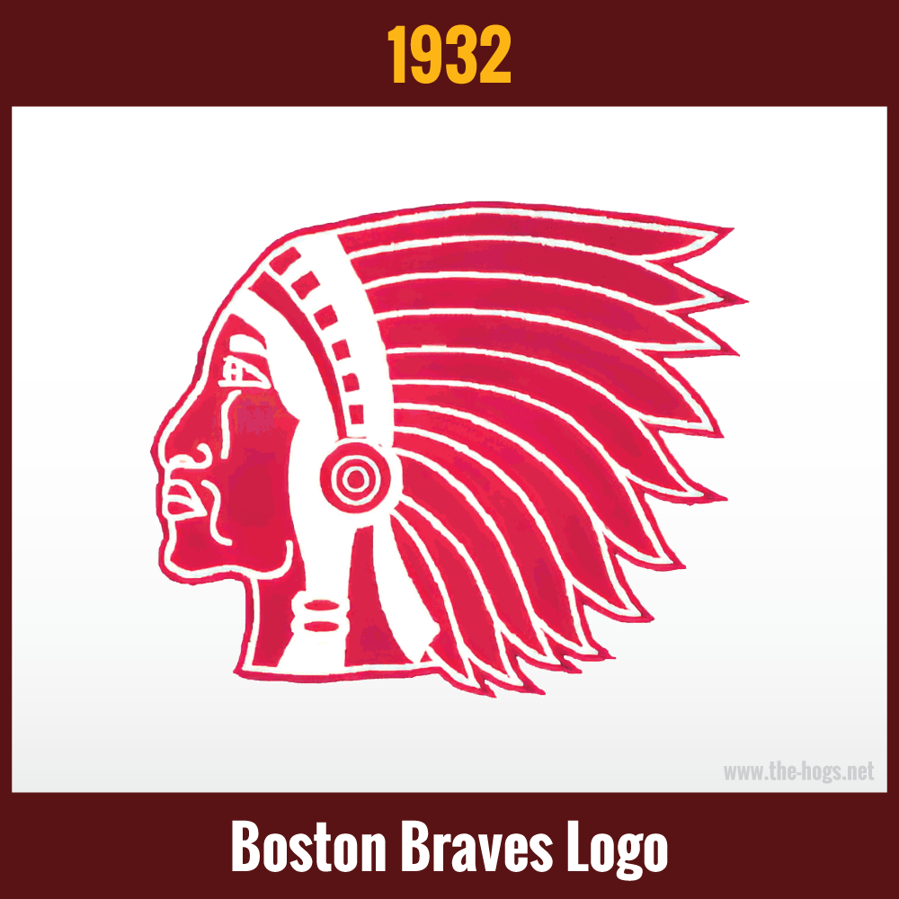
1932 Boston Braves Logo
When the franchise was originally awarded to George Preston Marshall in 1932, it was in Boston. Initially they took on the exact name and the logo of the existing baseball team there – the Boston Braves. The logo utilized a single-color design of the side profile of a Native American in traditional feather headdress. It was only used for the 1932 season.
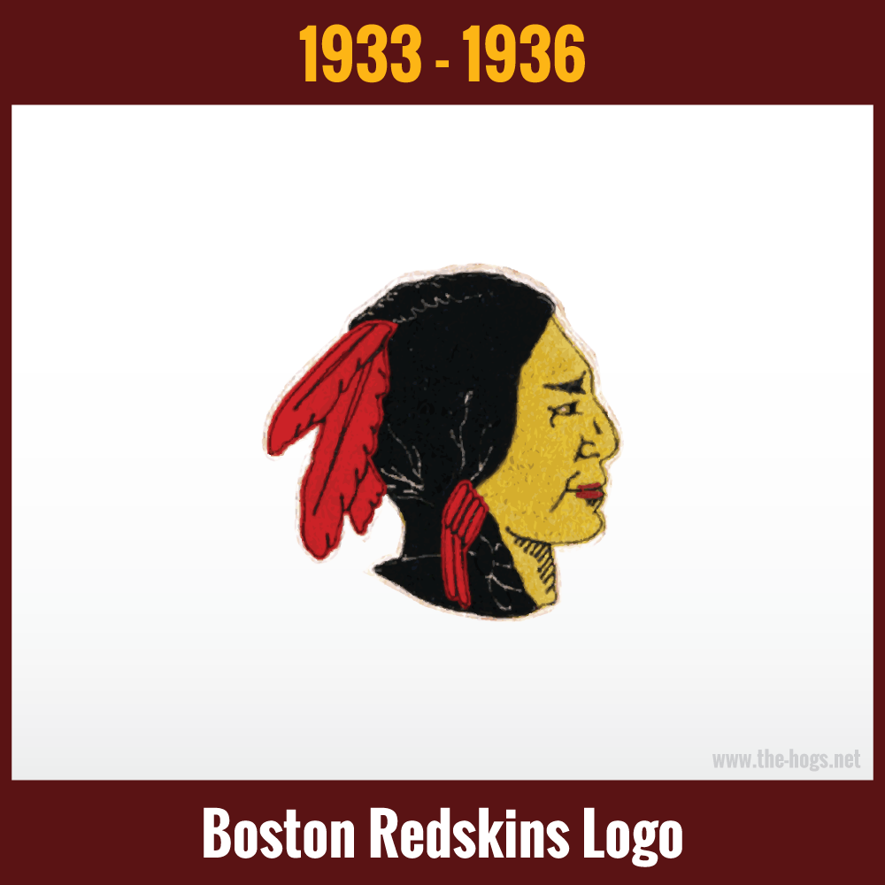
1933-1936 Boston Redskins Logo
In 1933, the franchise changed it’s name to the Boston Redskins. You will see different logos used for this time period in franchise history. This particular logo was chosen because early in 2021, an actual 1933 Boston Redskins jersey was found in a storage locker.
Once again, a side-facing Native American is used in the logo. This time, the full headdress has been replaced by two red feathers, as well as red garters in the braided hair.
Washington Redskins Logo History Takes Flight
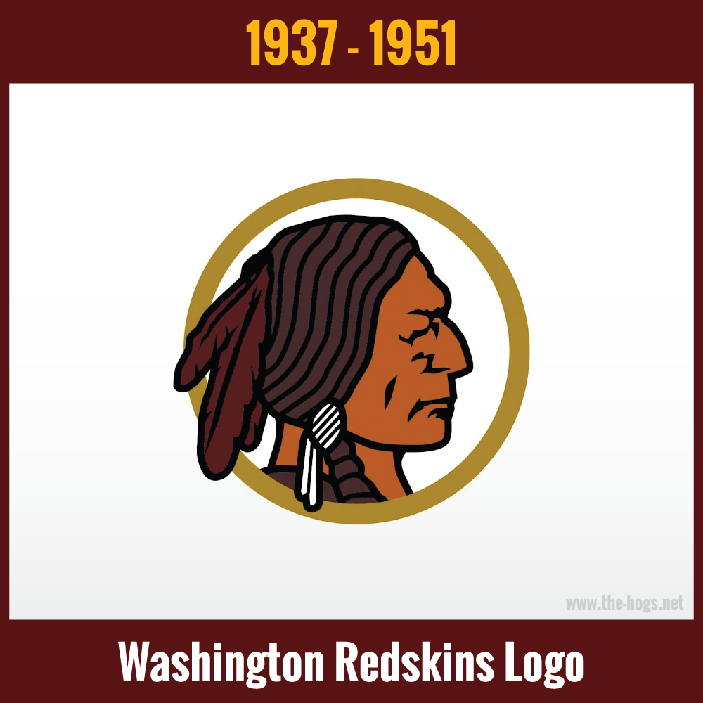
1937-1951 Washington Redskins Logo History
A facelift was in order when the franchise moved to D.C. and became the Washington Redskins in 1937. The side-facing Native American was more stern looking. The hair was now brown instead of black, and the skin-color a light brown. The garter in the hair was now white, and the feathers a deeper red, burgundy even. The whole head was surrounded by a yellowish-gold circle.
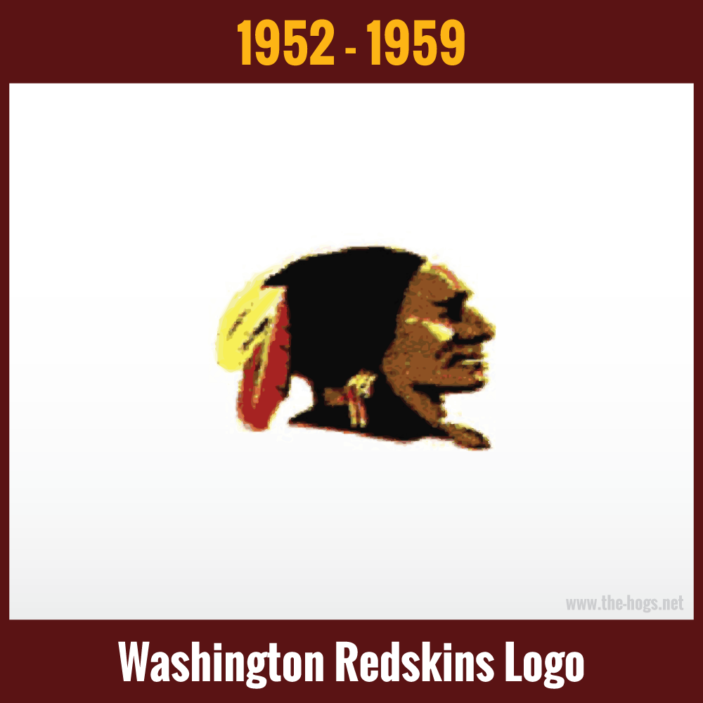
1952-1959 Washington Redskins Logo History
All images of this logo look like they were photographed with a potato.
The team was re-branding to a more “realistic looking” head. The feathers and garters in the hair were changed from burgundy and white, to red and yellow. The hair was returned to a black color, and the face remained brown.
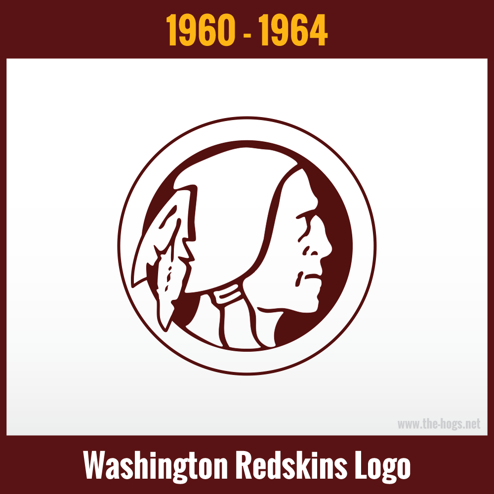
1960-1964 Washington Redskins Logo History
In 1960, it was back to simplicity. A deep red, one-color design of a Native American, facing right. It is almost a silhouette with only general lines defining the face, neck, two feathers, and hair tied into a bun. A white border was also used.
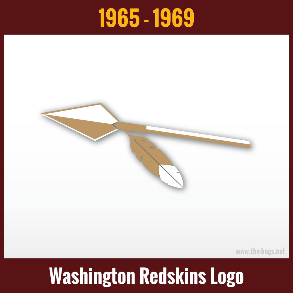
1965-1969 Washington Redskins Logo History
The franchise went in a completely different direction in 1965. The head was replaced with just a spear. A single hanging feather was used. A more goldish color took place of yellow, although you will see logo versions in white and yellow. The logo looked sharp against the burgundy backdrop that it was used against.
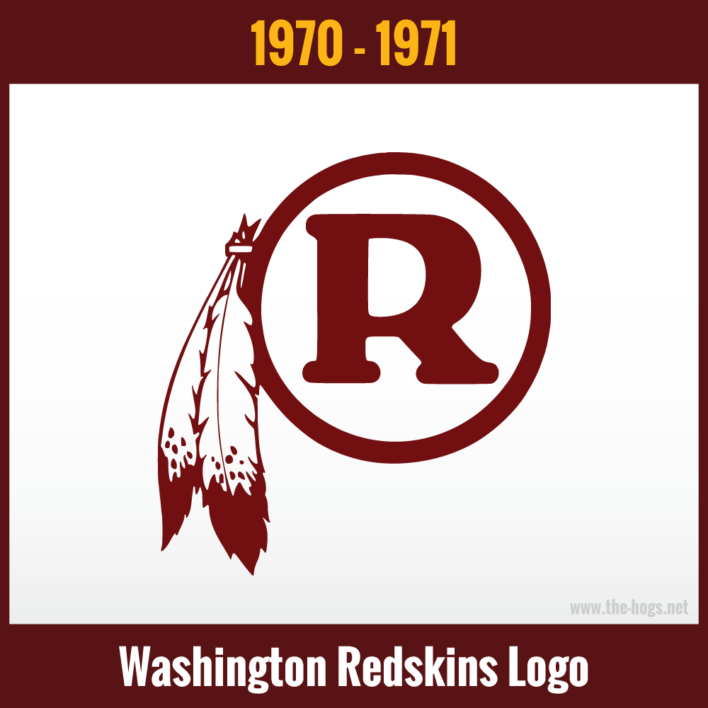
1970-1971 Washington Redskins Logo History
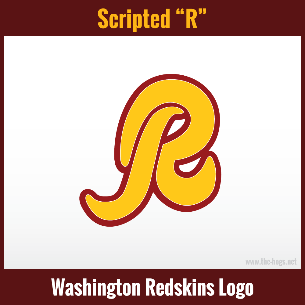
The arrival of Vince Lombardi in 1970, meant a drastic change. Consequently, a dark red letter “R” representing the team’s name, was placed on a white circular background, with a dark red circle around it. The Native American theme was kept, through the use of two feathers off to the side.
Other versions of this logo featured the same white feathers but with yellow tips, in place of the dark red.
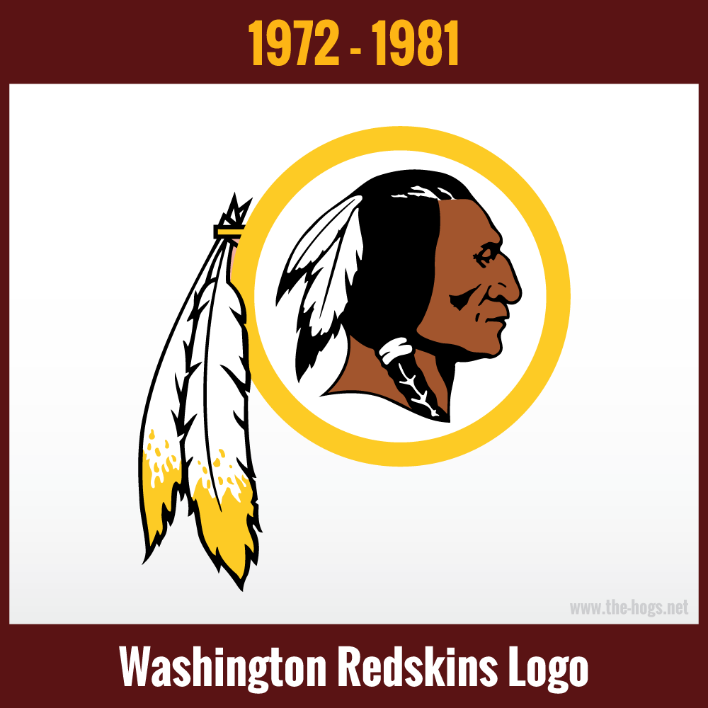
1972-1981 Washington Redskins Logo History
Designed in 1971 by Walter ‘Blackie’ Wetzel, the Redskins logo was used for nearly 50 years. Wetzel was the former President of the National Congress of American Indians and Chairman of the Blackfeet Nation.
Mr. Wetzel’s son Don made the remark in 2014:
“It needs to be said that an Indian from the State of Montana created the Redskins logo, and did it the right way. It represents the Red Nation, and it’s something to be proud of.”
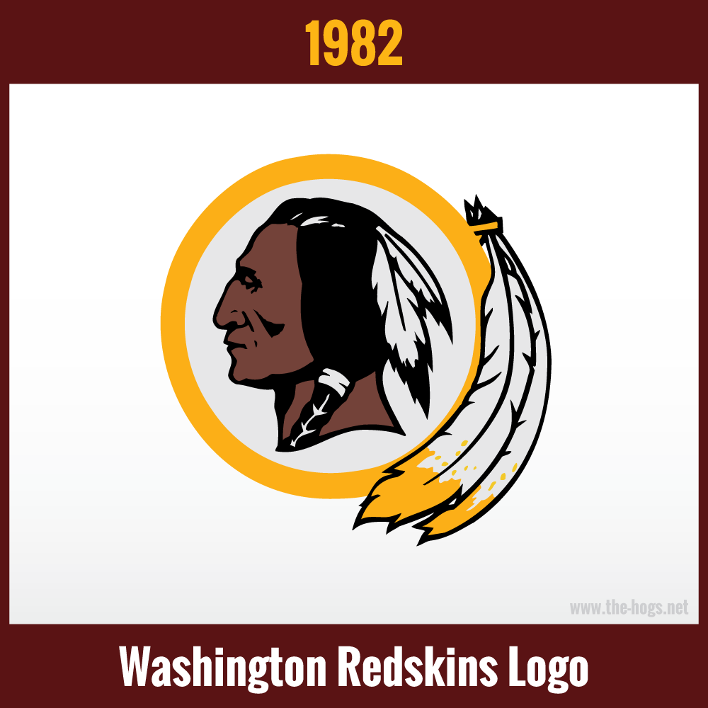
1982 Altered Logo
The feathers being pressed to the side of the helmet were a marketing requirement. They were designed to fit into round helmet stickers. Furthermore, the Native American also faces in the opposite direction in this version.
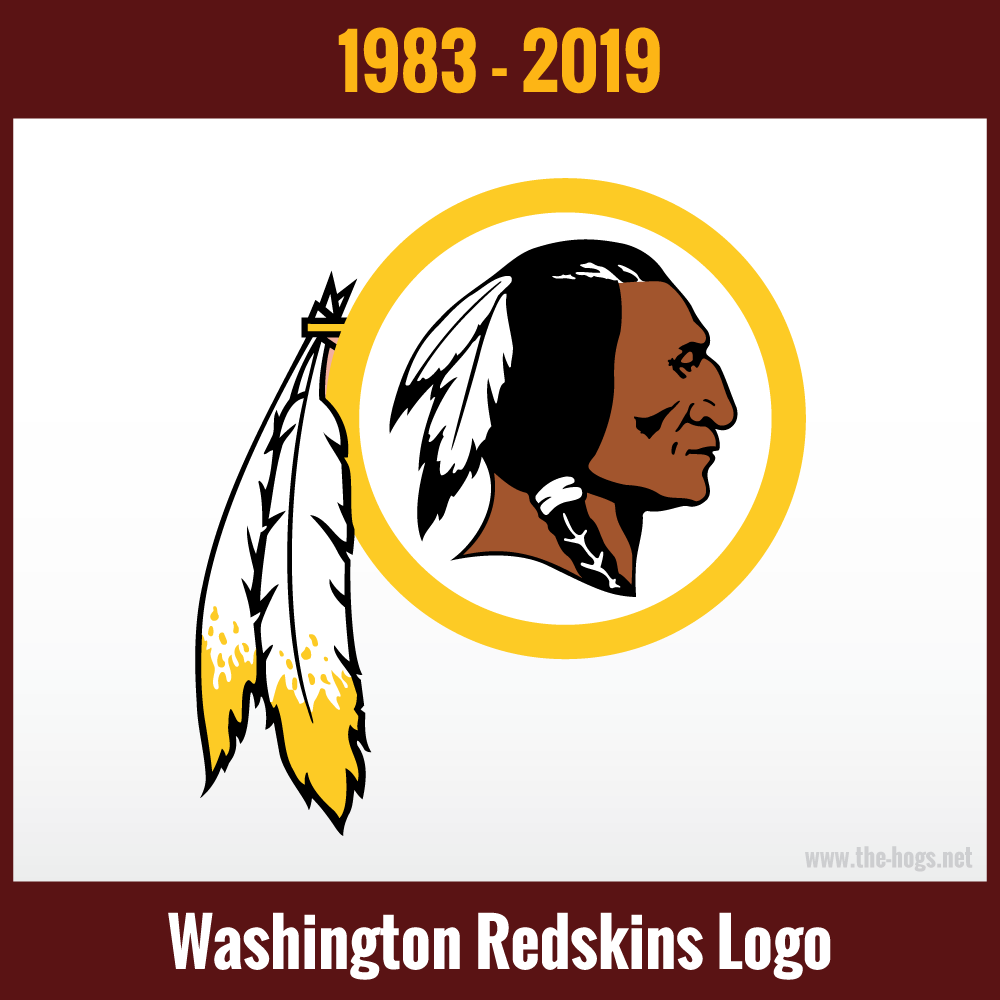
1983-2019 Washington Redskins Logo History
The 1983-2019 version was a simplified version of the 1972 logo with minimal changes. Dark gray shadows were used on the nose, mouth and cheekbones, instead of black. The lines on the face were thickened slightly. The skin color was darkened a few tones. Even with two helmets from different eras side-by-side, the differences are minimal and hard to immediately recognize.
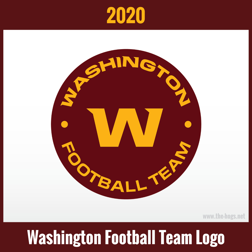
2020-2021 Washington Football Team Logo
In 2020, Washington did away with the Native American imagery. Obviously, the new design is completely different, but the team retains the burgundy and gold. Both colors are a few tones darker . Exaggerated triangular serifs appear on all the text in ‘Washington’ and the large ‘W.’ It is generally considered a stopgap until the franchise announces its new branding (again) in 2022.
Notably, the logo was not used on the burgundy helmet, with the team opting instead to place the players’ numbers in gold.
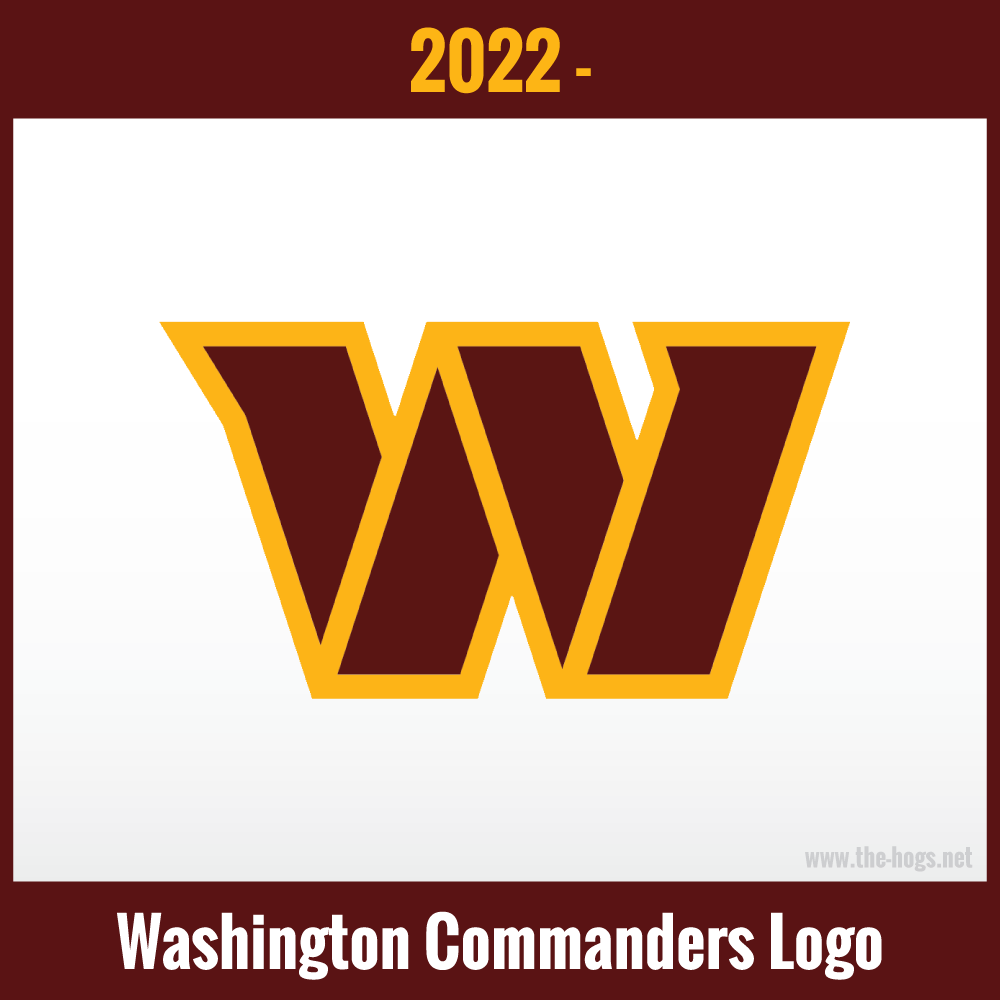
2022- Present – Washington Commanders Logo
On February 2nd, 2022, Washington announced that their official name moving forward would be the Washington Commanders.
Once again, the burgundy and gold on the helmet got a shade darker than the WFT logo. The font serifs on the “W” were also removed. They opted instead for a more three dimensional look, by outlining the burgundy “W” with the gold.
Their new helmets will also use a matte finish of burgundy, instead of the traditional satin finish.
Other Items in The Washington Redskins Logo History Bank
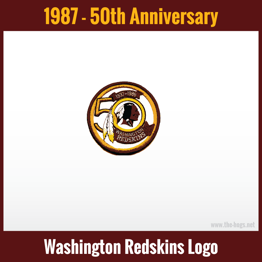
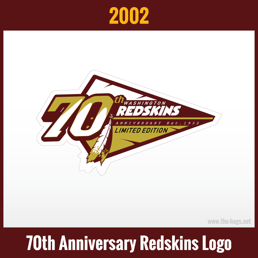
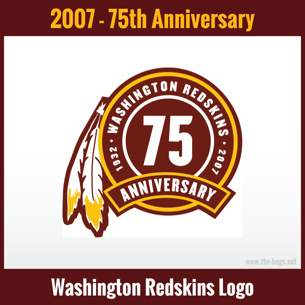
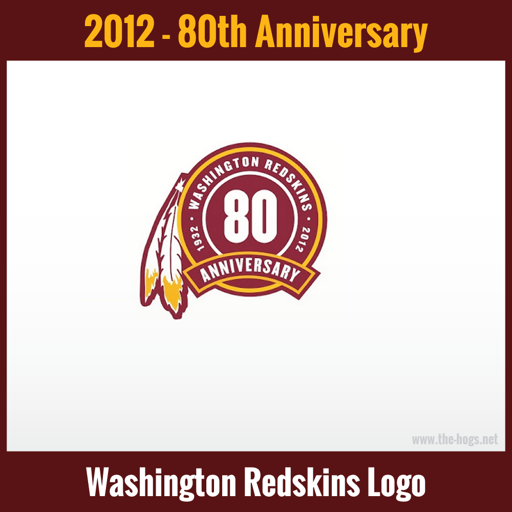
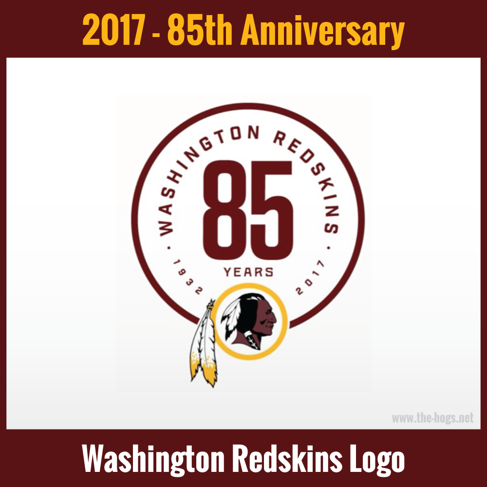
Washington Anniversary Logos
1987
2002
2007
2012
2017
Disclaimer:
We hope that people are not offended by this page. It is here to recognize the history of the Boston Braves / Boston Redskins / Washington Redskins / Washington Football Team / Washington Commanders franchise. It is not to make any political statement.
Don’t Miss: Washington Football Helmet And Uniform History
Explore More Washington Team History
For more great Redskins and Commanders history, use the links in the right side bar, or go to the History Content Hub and choose your next history destination from there.