Page 1 of 1
Proposal for new team logos...
Posted: Thu Sep 11, 2008 11:01 am
by Chris Luva Luva
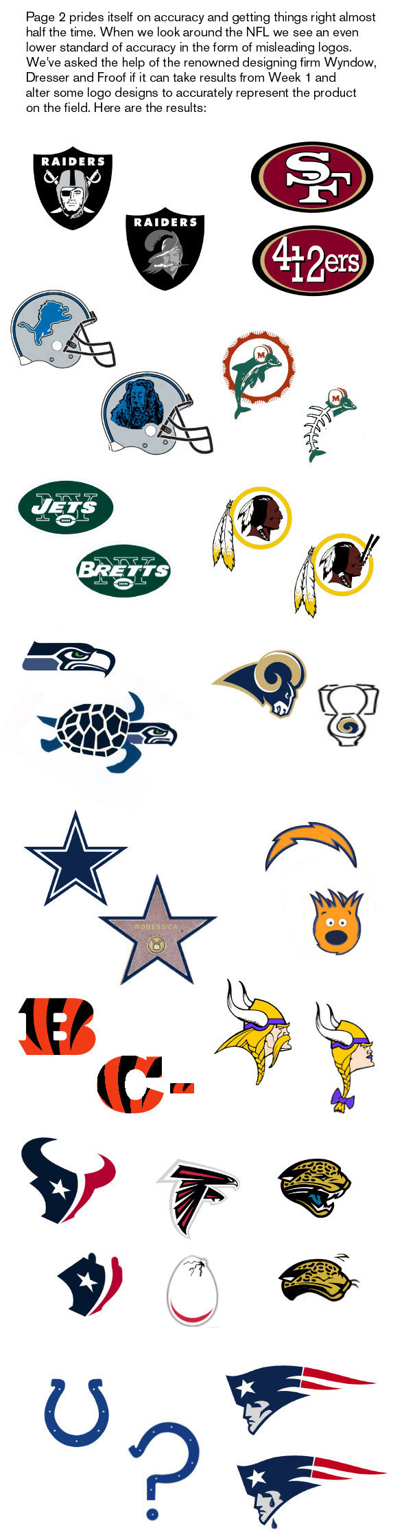
Courtesy of ESPN.
Posted: Thu Sep 11, 2008 11:05 am
by NC43Hog
Miami may be the best of the bunch.

Posted: Thu Sep 11, 2008 11:16 am
by Deadskins
I'm not sure I get the Raiders/Bucs thing (did Oakland sign a bunch of former Bucs or something?) or the San Francisco one either.
Posted: Thu Sep 11, 2008 11:29 am
by Bob 0119
Yeah, I didn't get the San Fran one either.
The Rams was funny though.
Posted: Thu Sep 11, 2008 11:49 am
by Deadskins
Maybe it's saying they will go 4-12 this season? Or they were in a lot of 4th and 12 situations?
Posted: Thu Sep 11, 2008 11:23 pm
by absinthe1023
The Rams logo is the absolute best, but the Lions logo is pretty classic.
I must be the only one who doesn't get the 'Skins logo....are those chopsticks, a nose plug, or a representation of some bizarre piercing?
Posted: Fri Sep 12, 2008 7:44 am
by Cappster
absinthe1023 wrote:The Rams logo is the absolute best, but the Lions logo is pretty classic.
I must be the only one who doesn't get the 'Skins logo....are those chopsticks, a nose plug, or a representation of some bizarre piercing?
I don't get the skins one either.
Posted: Fri Sep 12, 2008 8:08 am
by Warmother
absinthe1023 wrote:The Rams logo is the absolute best, but the Lions logo is pretty classic.
I must be the only one who doesn't get the 'Skins logo....are those chopsticks, a nose plug, or a representation of some bizarre piercing?
I think they are saying the Redskins stink.
As for the Raiders/Buc's logo, the Buccanners went 0-14. I think they are comparing the Raider's to that Tampa team.
I don't get the 49'ers either.
The Rams is great.
Posted: Fri Sep 12, 2008 8:12 am
by Cappster
I think for the 49ers logo that they are trying to say 4 - 12 = 9 (although it would be -9)
Posted: Fri Sep 12, 2008 9:07 am
by JansenFan
I think SF is the 4-and-12ers, as in their record by the end of the season.
Posted: Fri Sep 12, 2008 9:15 am
by Deadskins
Cappster wrote:absinthe1023 wrote:The Rams logo is the absolute best, but the Lions logo is pretty classic.
I must be the only one who doesn't get the 'Skins logo....are those chopsticks, a nose plug, or a representation of some bizarre piercing?
I don't get the skins one either.
It's a clothespin. They're saying we stunk up the joint.
Posted: Fri Sep 12, 2008 9:43 am
by BigRedskinDaddy
Funny. Gotta agree that the Fins new logo is the best, closely followed by the Lions and the Viqueens. LOL!!
They better not mess with the indian head though -
Posted: Fri Sep 12, 2008 9:53 am
by Chris Luva Luva
BigRedskinDaddy wrote:They better not mess with the indian head though -
Um....look at the chart again...
Posted: Fri Sep 12, 2008 3:15 pm
by BigRedskinDaddy
Chris Luva Luva wrote:BigRedskinDaddy wrote:They better not mess with the indian head though -
Um....look at the chart again...
I DID. I'm warning them, they had better not -

Posted: Fri Sep 12, 2008 3:34 pm
by joebagadonuts
I saw another Pats one recently that had the Elvis guy with a video camera up against his eye. Very amusing.
Edit:
Here it is.
Posted: Fri Sep 12, 2008 4:12 pm
by BigRedskinDaddy
joebagadonuts wrote:I saw another Pats one recently that had the Elvis guy with a video camera up against his eye. Very amusing.
Edit:
Here it is.
Winner, winner, chicken dinner! That is priceless.
Posted: Sun Sep 14, 2008 1:35 am
by tribeofjudah
Bob 0119 wrote:Yeah, I didn't get the San Fran one either.
The Rams was funny though.
San Fran is the 4 and 12ers.........